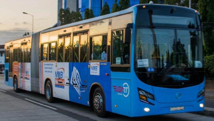
The Lagos bus rapid transport system (BRT) was launched in March 2008, by the Lagos state government, for commuters as a reliable means of transportation across the city. In February 2021, the State government decided to go cashless with the Cowry transport payment system: bus fares will be paid with the Cowry card.
The total number of Lagosians who use the BRT daily has been summed up to 200,000. However, commuters complain of shortage of buses, late arrival at destinations, and the payment system (the Cowry app).
My goal was to create a user-friendly mobile app where the Lagos BRT commuters can track, search for buses, and also set reminders for when their bus arrives. A redesign of the Cowry Payment Mobile app would also include better user interface and user experience. Providing customer support where commuters chat with support officers and a FAQ page giving adequate information on how the app works were also critical features required. As a user of the Lagos BRT service myself, I had my personal experiences with Lagos BRT, but I still went to talk to some commuters. We discussed how the app should look, features that should be included. I also paid close attention to commutersŌĆÖ complaints.
Read Also: BRT goes cashless from February 1, says LAMATA
The user experience (UX) phase began with getting to know commuters and their behaviours. The research goals were aimed at getting a clearer idea of the problem as it directly affects the BRT users and uncover needs and frustrations to understand in creating a better experience for them. I created a survey form and shared it on social media platforms. Some of the questions I asked in the survey are: How often do you use the Lagos BRT service? Your experience? What can be done to make commuters more comfortable? Have you used the Cowry card to pay for your bus fare? Have you used the Cowry mobile app? Do you think the Cowry mobile app should be redesigned? Do you think there should be a mobile app for Lagos BRT If yes, what features do you want the app to have?
To support my thought process and to ensure that I do not create a biased solution, I used the qualitative data gathered during the research process to create two personas that would serve as a guide. This kept the design process user-centred on commutersŌĆÖ varying goals and needs and better design decisions. Going through the feedback from the research, I figured out the importance of allowing commuters to search for their buses and see when the bus will arrive at the bus station. After ascertaining user pain points, I worked on possible solutions for the app flow and an aesthetically pleasing user interface (UI). I mapped a user flow to outline the app architecture and user journey. The user flow is the blueprint of the user experience. It informed me on what screens I needed and the major section that needs to be filled in. When I started approaching the problem, I sketched out what the app should look like and options of how I could redesign the Cowry app and resolve the above-mentioned problems. Onboarding is an important process that guides your users through and familiarizes them with the app. This process helps in communicating with users, expressing the appŌĆÖs value, and facilitating a positive user experience.
The home page of the current Cowry app only includes the customerŌĆÖs wallet balance, buttons for card top and payment. I designed a new home screen to include more features like search for bus, top-up button, recent transit history, and available buses. This is a new design created after the user research had been conducted. BRT commuters want a process where they can search for buses, view all the available buses at a particular terminal. I also added a feature where you can set a reminder once your bus arrives.
I redesigned the Cowry dashboard, recreated the buttons for top-up and transfer, and also added a transfer button on the dashboard, and improved the UI. I redesigned the top-up process and created two options of the top-up process: 1. Top up by including your card details and paying online; 2. Top up by bank transfers, users generally do not like the idea of exposing their card details online thatŌĆÖs why this process was created. Using Figma Prototype, it was challenging and fun for me to prototype the design. I needed it to be like a real app since I would be testing it using my mobile phone. I prototyped the entire major screens and the basic interactions and micro-interactions to give users the feel of a live app.
Working on this Case Study was a great opportunity for me to dive deeper into Information Architecture, user research, and visual design. I have enjoyed my time working on this project and I would love to continue in my journey of understanding business and usersŌĆÖ needs to create great experiences for Apps. Importantly, the Lagos BRT and Cowry system need to prioritise user experience, and respond to user experience issues from customers; this will help to retain lots of customers.

Olatunji is a User Experience/Interface┬Ā(UX/UIUX) designer.┬ĀOjuolatunji95@gmail.